


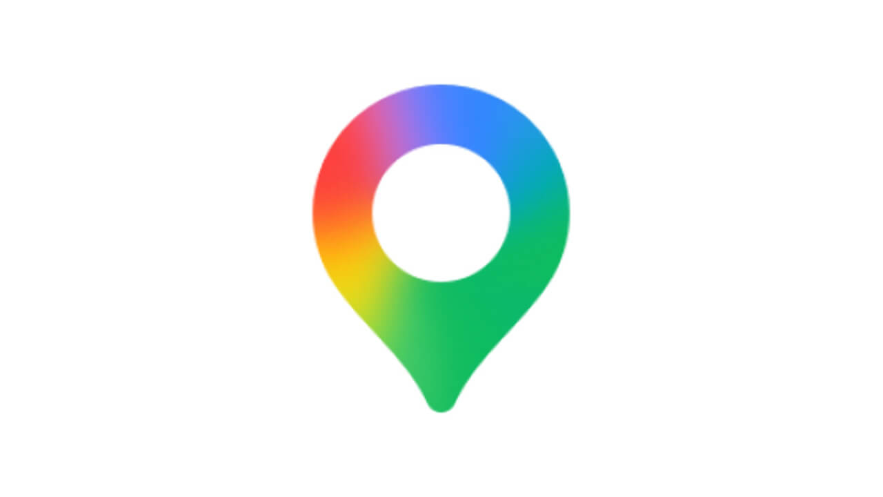
- The Google Maps logo is set to be refreshed with a Google AI “Gemini” style design, featuring a seamless four-color gradient of red, yellow, green, and blue, similar to the logos for Google, Google Photos, and Google Home.
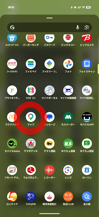
- Following the v26.09.06 update of the Android version of the Google Maps app, the refreshed logo has been confirmed in locations such as the app drawer.
- This is the first logo refresh for Google Maps in approximately six years, with the last update occurring on February 6, 2020, to commemorate its 15th anniversary.
The logo for Google’s mapping service, Google Maps, is expected to be refreshed with a gradient design inspired by Google AI “Gemini,” where the four colors of red, yellow, green, and blue blend seamlessly—similar to the logos for Google, Google Photos, and Google Home.
Following the rollout of the Android version of the Google Maps app (v26.09.06) on Monday, March 2, 2026, we confirmed that the logo has been updated in the app drawer and other areas. As with Google Home, it is slightly more rounded than before.
Meanwhile, the old logo remains on the Google Maps app pages in the Google Play Store and App Store, as well as on the web version of Google Maps. Starting with this logo refresh on the Android app, the rollout is expected to expand gradually.
Notably, this is the first logo refresh for Google Maps in about six years, since the update on Thursday, February 6, 2020, which celebrated the service’s 15th anniversary.
Google Maps App Links


Source: Google Maps
コメントを残す