



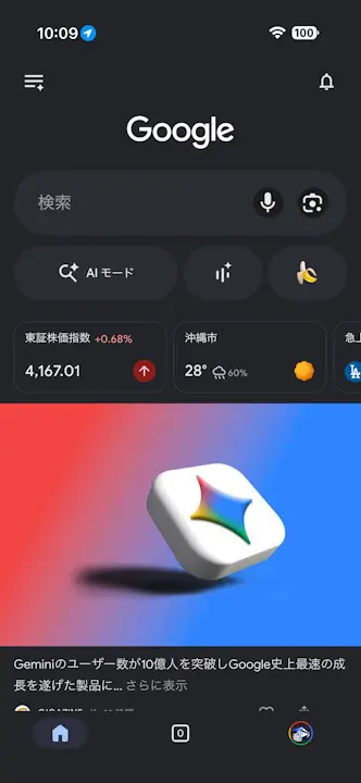
- iOS version of the “Google” app suddenly receives a major UI overhaul with app version v433.5.
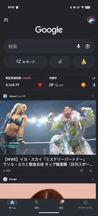
- The user icon (Google Account menu) previously located in the upper right corner has been swapped with the “Notifications” icon located in the bottom bar.
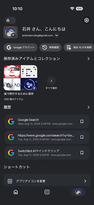
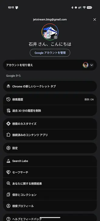
- The “Activity” feature, previously located in the bottom bar, has now been integrated into the Google Account menu.
The iOS version of the “Google” search app has suddenly undergone a major UI overhaul with the release of app version v433.5.
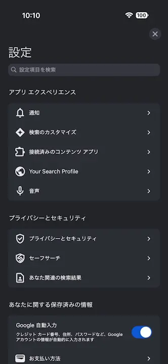
In this heavily redesigned iOS “Google” app, the user icon (Google Account menu) previously placed in the upper right corner of the screen has been swapped with the “Notifications” icon that was located in the bottom bar. Furthermore, the “Activity” feature, which was previously located in the bottom bar, has now been integrated into the Google Account menu.
With various elements swapped, integrated, and the overall UI revamped, it has honestly become a bit confusing. It will likely take some time to get used to.
Meanwhile, below is the Android version of the “Google” app, which has not yet received the major UI redesign. It will likely be updated in the near future as well.
“Google” App Links