


Key Points of This Article
- Google announces its first logo refresh in a decade, a new company-wide “Google G” that visually reflects its evolution in the AI era.
- The new “Google G” icon symbolizes both the Google brand and the company itself.
- While staying true to its four colors of red, yellow, green, and blue, it adopts brighter hues and a gradient design.
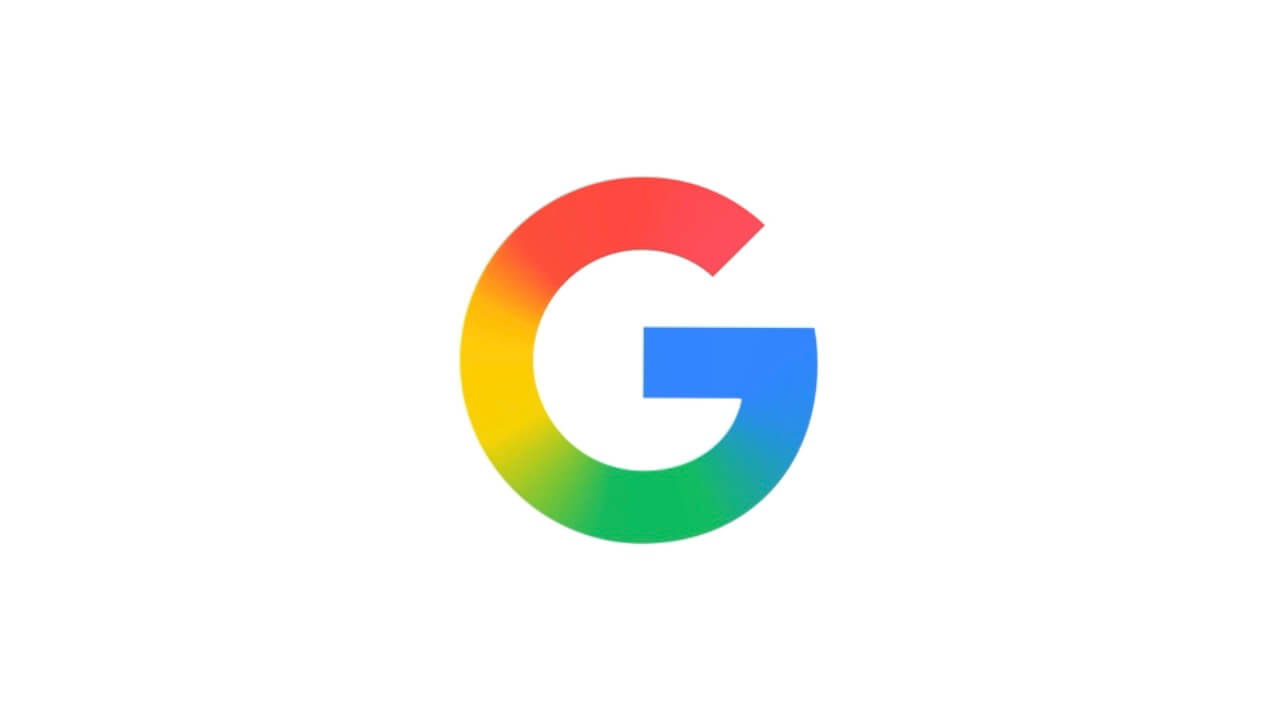
On Monday, September 29, 2025, Google announced its first logo refresh in 10 years, introducing a new company-wide “Google G” to visually reflect its evolution in the age of AI.
The new “Google G” icon symbolizes both the Google brand and the company itself. While staying true to its four colors of red, yellow, green, and blue, it adopts brighter hues and a gradient design.
Although the refresh of the new “Google G” icon was confirmed back in May 2025, this marks its official company-wide rollout. The update also aligns with the logo for Google’s AI, “Gemini,” which was refreshed in July 2025.
The logo for the smart home service “Google Home” was also just recently updated, and this new logo will be rolled out to more products, platforms, and services over the coming months.
Source: Google